Perler & Fuse Bead Color Chart
A plain-English guide to reading a perler bead color chart: how Perler, Hama, and Artkal each label their colors, how many colors each brand carries, why the codes never match across brands, and how to land on the exact shade you need.
What a fuse bead color chart is
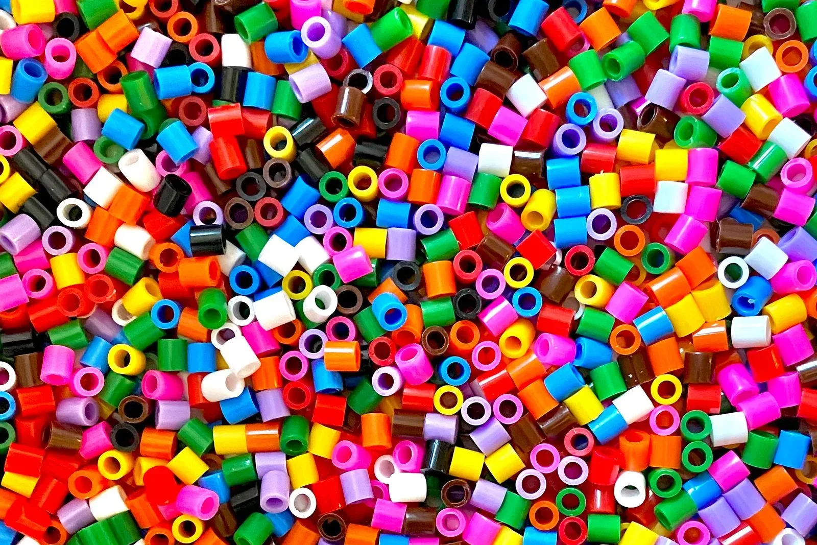
A perler bead color chart is the master list of every color a brand makes, each shown as a swatch with its official label. It exists because you cannot order "that blue" — you order a specific, named or numbered color, and the chart is how you point at the right one. Every serious fuse-bead brand publishes one, and the community maintains cross-reference versions with hex values.
The catch is that each brand labels colors its own way, and none of the systems line up. A color chart from Perler, one from Hama, and one from Artkal describe overlapping ranges of plastic in three different languages. Understanding those three systems is the whole game, because it is what lets you translate a design between brands or shop for the exact shade you saw somewhere else.
How each brand labels its colors
Three brands dominate fuse beads, and each uses a different labeling convention. This is the core of any fuse bead color chart, so it is worth memorizing which is which.
| Brand | Label style | Example | Approx. colors |
|---|---|---|---|
| Perler | Color names | Cheddar, Kiwi Lime, Toothpaste | 80+ (about 89) |
| Hama | Numeric H-codes | H01, H02, H10, H101 | ~60 core Midi, more with specialty |
| Artkal | Letter + number codes | S100 (5 mm), C-line minis | 200+ in the 5 mm range |
Perler leans on evocative names — some, like Cheddar and Toothpaste, tell you nothing about the actual hue until you see the swatch. Hama keeps it clinical: H01 is one specific color across the whole Midi range, and higher numbers like H101 mark colors added later. Artkal prefixes the code with a letter for the bead line — S for its 5 mm midi beads, C and A for the 2.6 mm minis — then a number, which is why the same visual color can carry a different code in each Artkal line.
Each system has a trade-off. Names are memorable but ambiguous, and they get retired and reused as the lineup changes, so an old pattern calling for a discontinued name can leave you guessing. Numbers and codes are stable and precise but meaningless until you see the swatch — nobody pictures a color from "H27." Artkal's huge range is a blessing for matching a specific shade and a burden when you are scrolling 200-plus codes to find it. Knowing which pain you are dealing with tells you how to shop: by swatch for Perler, by number for Hama, by filtered search for Artkal.
Perler color families and how many colors there are
Perler carries more than 80 colors in its standard line — roughly 89 individual solids and striped beads — and the roster changes as colors retire and seasonal shades appear. That is a lot of choice, but it is worth grouping into families so a color chart is navigable rather than overwhelming:
- Core solids: white, black, grey, and the primary and secondary hues you reach for constantly.
- Pastels: muted, chalky versions of the brights, good for soft designs and skin tones.
- Neons: high-saturation colors that pop, useful sparingly as accents.
- Specialty finishes: translucent, glow-in-the-dark, glitter, and metallic beads that behave differently under the iron and in light.
The specialty finishes are the ones to watch: a translucent or glitter bead reads differently from a solid of the "same" color, much the way bead finish changes apparent color in seed beads. If finish and value are new territory, our bead color palette guide covers how finish and contrast decide whether a palette reads clearly.
Reading the codes and why they are not universal
The single most useful thing to know: the codes do not translate between brands. There is no shared standard where color 42 means the same thing everywhere. Perler's "Cheddar" is not Hama's H-anything by rule; any match is something a person worked out by comparing swatches, and it is approximate.
That matters the moment you mix brands — which builders do all the time, because Perler, Hama Midi, and Artkal S beads are all 5 mm and share pegboards, so you reach across brands to get a color one of them does not carry. When you do, you are matching by appearance, using a community conversion chart, not by trusting that two codes are equivalent. For the full picture of which brands' beads physically mix, see Perler vs Hama vs Artkal.
Match by value, not by name. Color names are marketing and numbers are internal, so the only reliable comparison is the actual color value — a hex code or a side-by-side swatch. Two beads that "sound" similar can be a shade apart; two that sound unrelated can be a near-perfect match.
How to find the right color
Working from a design — a photo, a drawing, a palette you liked — the goal is to land each area on a real bead code you can actually buy. Done by hand, that means holding swatches against the image and guessing, then hoping the code you wrote down is stocked. It is slow and error-prone, especially across 80-plus Perler colors or 200-plus Artkal ones.
The reliable method is to compare color values, not labels: take the color you want, find the nearest bead in your chosen brand's real palette by its measured hue, and buy that code. This is exactly the kind of nearest-match problem software is good at, which is where a tool earns its place — see what to look for in bead pattern software.
Why the swatch lies about specialty finishes
A color chart shows every bead as a flat swatch, which is honest for solids and misleading for everything else. A translucent bead's chart color is the plastic held to the light; in a dense design, backed by its neighbors, it reads darker and muddier. A glow bead looks pale mint on the chart and washes out in daylight. Glitter and metallic beads throw specular highlights a flat swatch cannot show at all.
The practical rule: treat specialty finishes as approximate on any chart, and buy a small amount to test before committing a whole design to them. Two beads that share a name across a solid and a translucent version are not interchangeable — the finish changes the value, and value is what carries a design. This is the same trap that catches seed beaders, where an AB or matte coat shifts a bead's apparent color enough to break a palette.
Solids are the safe backbone of any chart. Build the structure of a piece in solids, where the swatch tells the truth, and use specialty finishes as deliberate accents you have tested, not as load-bearing colors you trusted from a printed square.
How Beadify helps
Instead of eyeballing swatches, Beadify reads every pixel of your photo and matches it to the nearest real bead in the brand you pick — Perler, Hama, or Artkal — then prints the exact code for every bead on the chart. You get a shopping list in the brand's own language: Perler names, Hama H-numbers, or Artkal codes, whichever you are buying.
That turns a color chart from a wall of swatches you squint at into a finished, buyable list. Because the match is done on the actual color value, the beads you order look like the design you started from — no "close enough" surprises when the bag arrives.
Related reading
To turn color codes into a finished, buyable design, these pair well with this reference:
- Bead Color Theory: Build a Palette That Works covers how finish and contrast decide whether colors read.
- Perler vs Hama vs Artkal explains which brands' beads and colors physically mix.
- Bead Pattern Software: What to Look For covers matching image colors to real bead codes.
Learn the three labeling systems, accept that no code translates across brands, and match by color value rather than name. Do that and a color chart stops being a guessing game and becomes a precise shopping list.
Match every color in your photo to the real Perler, Hama, or Artkal code.
Try it free →